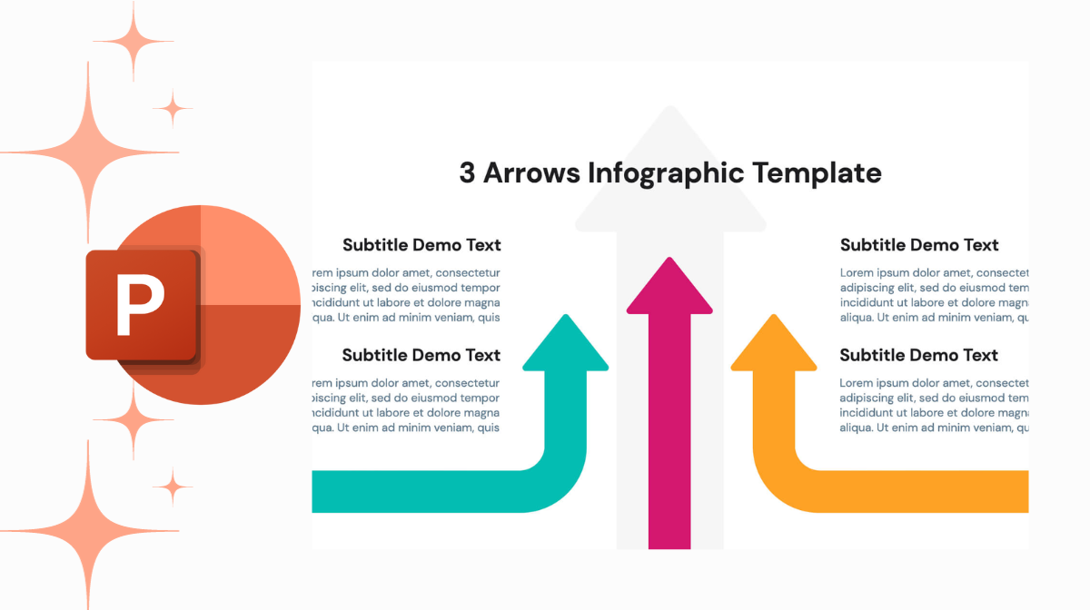
As a proficient marketer and graphic designer, I’ve delved into countless presentations. Today, let’s unravel the artistry behind creating dynamic arrow infographics with seamless transitions in PowerPoint. Follow along, and you’ll discover how to tailor these visuals to your unique needs.
Designing the Left Side
Let’s embark on the left side of the arrow. Begin by navigating to the Format Background option, where a dark radial gradient fill awaits. Opt for a radial fill with a dark outer hue and a light center. This sets the stage for the visual journey.
Moving to the Insert tab, summon an arrow shape onto the canvas. A quick rotation, a color change to light blue, and voilà – the foundation is set.

Creating Alert Arrows on the Side
Extend your creativity with alert arrows. Choose a Broken Arrow selection and opt for the first arrow. Duplicate it, adjust its thickness, and position them in a mirrored fashion. Shadows are the secret sauce here – make them subtle yet impactful.
The Right Side Magic
Now, mirror the entire process for the right side. Match the darkness gradient, align arrows, and add shadows for a cohesive look.
Adding Content to Your Slide
No infographic is complete without substance. Add text boxes for a title and subtext. Play with fonts, sizes, and alignments. Achieve symmetry and balance by utilizing the Align options.

Inserting Icons for Visual Appeal in PowerPoint
Incorporate icons to amplify your message. White icons on a blue background create a striking visual contrast. Ensure they align seamlessly with your text, enhancing the overall aesthetics.
Slide Duplication for a Smooth Transition
Duplicate the slide and employ a neat trick. Vertically arrange content and shift everything to the top, creating a harmonious transition. Ensure the arrows align perfectly for a polished look.
Perfecting the Transition Effect
Fine-tune the transition effect by adjusting timings. A subtle push transition with a two-second duration adds a professional touch. This way, your content seamlessly shifts, engaging your audience without disruptions.
Crafting a Captivating Title Slide
No presentation is complete without a compelling title slide. Duplicate the first slide, remove content, and design a captivating title. Utilize contrasting colors, and play with fonts and shadows, creating a visually appealing introduction.
Applying Transitions and Final Touches
Apply transitions to your title slide, maintaining consistency in timing. Preview your creation, ensuring a fluid shift between slides. The result? A captivating arrow infographic with a professional touch.
Your PowerPoint Infographic Mastery
There you have it – a step-by-step guide to crafting engaging arrow infographics with smooth transitions in PowerPoint. These visuals add flair to your presentations, enhancing aesthetics and message delivery. Experiment, personalize, and remember – simplicity is key. Each element contributes to the overall impact. Now, armed with this knowledge, create, and captivate your audience with compelling PowerPoint infographics.
Frequently Asked Questions (FAQs)
How can I create impactful infographics in PowerPoint?
Use PowerPoint’s shapes, icons, and SmartArt tools to visualize data and concepts. Keep it simple, use contrasting colors, and maintain consistency.
Are there specific templates for infographics in PowerPoint?
Absolutely! PowerPoint offers a range of infographic templates. Navigate to the “Insert” tab, select SmartArt, and explore various options tailored for data presentation.
Can I customize the colors and fonts in PowerPoint infographics?
Yes, you can! Click on the elements you want to modify, go to the “Format” tab, and use the options to change colors, fonts, and other styling to match your theme.
How do I ensure my PowerPoint infographic is visually engaging?
Focus on clarity and simplicity. Use visuals to complement your message, maintain a consistent theme, and avoid overcrowding. Test it on others for feedback!
Related Articles:


