Hello, food enthusiasts! Ready to dive into the delicious world of crafting web banners that’ll make your audience drool? Well, you’ve landed in the right spot! In this blog, we’re serving up some friendly advice to help you whip up banners that not only look good enough to devour but also leave your visitors hungry for more. So, tie on your aprons, and let’s get cooking with these tasty design tips!
Starting the banner with Fresh Vibes
Picture a blank canvas—fresh, clean, and ready for action. Add a sprinkle of texture, and voila! Showcase your star dish against a backdrop that’s as perfect as your grandma’s secret recipe.

Mouthwatering Imagery
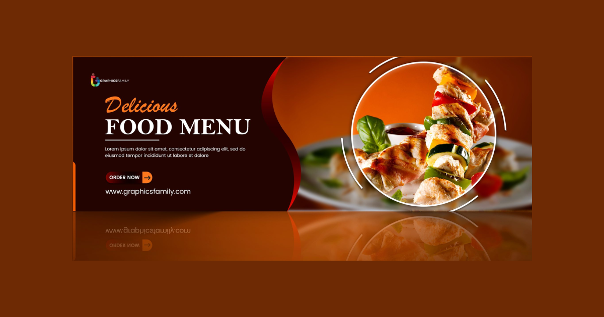
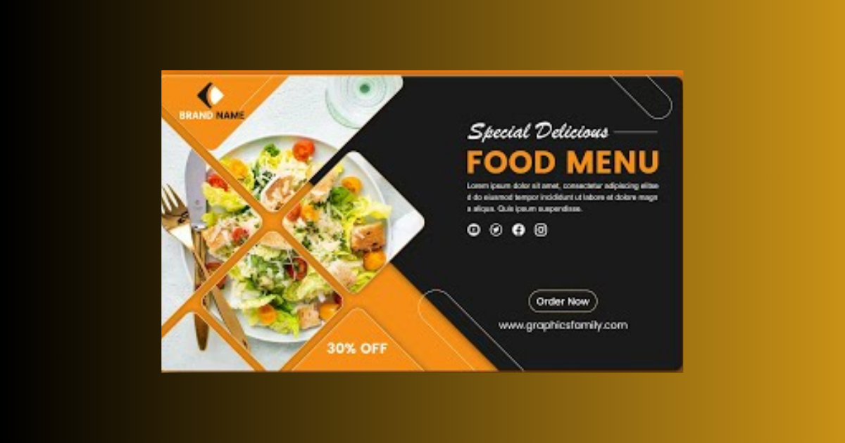
Time to pick out the good stuff—high-quality, drool-worthy images of your food. Whether it’s a cheesy burger, a rainbow salad, or a dreamy dessert, let those images steal the spotlight and make tummies rumble.
Pop-Tastic Colors
Let’s play with a palette that suits your cuisine. Earthy tones for comfort grub, fresh greens for salads, or bold and exotic colors for adventurous bites. Keep it visually delicious, like a feast for the eyes!
Font Fun
Choosing fonts should be like picking the perfect spice – easy on the eyes with a dash of personality. Whether it’s classy scripts or bold sans-serif, find the flavor that matches your style.
Mouthwatering Call-to-Action
Cook up a call-to-action (CTA) that’s as irresistible as your dishes. “Order Now,” “Explore Our Menu,” or something equally tasty – make it a click-worthy invitation to culinary bliss.
Playful Touches
Sprinkle in some food-related icons or playful illustrations. Think utensils, chef hats, or cute food icons that add a dash of fun to your tasty design. Let’s keep it lighthearted and delightful!
Looks Yummy Everywhere
Ensure your creation looks just as tempting on a tiny phone screen as it does on a big desktop. Responsive design is the secret sauce, making sure your culinary creations shine on every device.
Keep the Flavor Familiar
If you’re whipping up designs for a specific eatery or food brand, keep the flavors consistent. Use their logo, colors, and style to create a mouthwatering and cohesive experience.
Seasonal Surprises
Shake things up with seasonal themes or highlight special dishes. Let your banners scream freshness in the summer and warmth in the winter – keeping it as fresh as your ingredients.
Taste-Test with Friends
Before serving your creation to the world, get some feedback. Share your design with friends, colleagues, or potential customers to see if it makes their taste buds dance.

Stay on the Yummy Side
Make sure your design stays within the bounds of copyright laws. Stick to reputable stock photo sites or whip up your visuals to stay on the safe and savory side.
Crafting web banners for food is like preparing a feast for the eyes. Armed with these friendly tips, go ahead and let your creativity sizzle. Cook up designs that not only showcase your culinary delights but also leave everyone eagerly anticipating their next tasty adventure.
Frequently Asked Questions (FAQs)
What makes a great food website banner?
Engaging visuals, vibrant colors, and enticing food imagery draw attention instantly.
How can I ensure my banner stands out?
Use high-quality images, simple yet compelling designs, and captivating headlines.
Do I need to stick to a specific size for web banners?
Yes, adhere to standard dimensions like 728×90 pixels or 300×250 pixels for optimal display.
Can a food banner impact user engagement?
Absolutely! A well-designed banner can attract users, increasing clicks and site interaction.
Related Article:


