
Hey there, parents and entrepreneurs! In this digital age, where children are practically born with iPads in hand, designing products that captivate their attention is both an art and a science. Kids demand products that are not only entertaining but also visually appealing. So, buckle up as in this blog we will delve into the secrets of designing for kids in the 21st century!
Following Points to Remember for kids Designing Brands:
Let Cartoon Characters Steal the Show
We all know the universal appeal of cartoons, and kids absolutely adore them. Incorporating a cute and relatable character or mascot into your branding can work wonders. Just look at Nintendo’s Mario or McDonald’s Ronald McDonald. These characters not only make the brand memorable but also create an emotional bond with the little ones. Remember, a friendly face can make your brand instantly approachable and unforgettable.

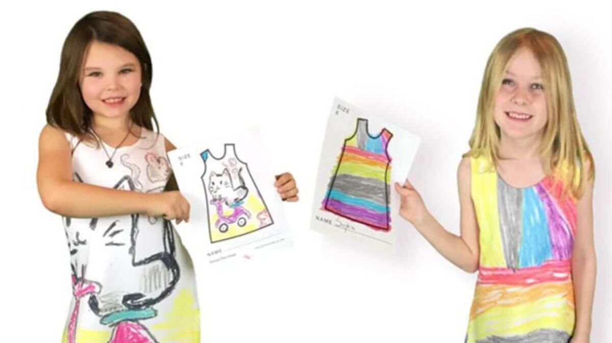
Dive into the Colorful World of Childhood
Childhood is synonymous with color and vibrancy. Muted tones won’t cut it when you’re designing for kids. Think of the rainbow and all its vibrant hues. Bright primary colors like red, yellow, and blue, or lively secondary colors like orange, green, and purple are the way to go. Just take a peek at packaging from L’Oreal Kids Shampoos or Playskool’s Tickle Me Elmo Doll. These colors not only grab attention but also evoke a sense of fun and excitement.
Appealing to Parents
Here’s the thing – while designing for kids is essential, it’s equally crucial to appeal to parents. After all, they’re the ones with the purchasing power. Striking a balance that pleases both children and parents is the key to success. Take Melissa and Doug, for instance. Their nostalgic yet fresh line of toys, coupled with a website design that’s both playful and informative, speaks to both kids and parents.
Remember, your branding and design need to resonate with the young ones, but it also needs to assure parents that they’re making the right choice for their children. So, when you’re creating your kid-focused brand, think about both the little dreamers and their guardians.
In Conclusion, designing for kids is undoubtedly a challenge, but armed with these tips, you’re ready to create something truly magical. Incorporate captivating characters, splash vibrant colors, and remember to speak to both the kids and their parents. Your brand could be the next big thing, capturing the hearts of children and parents alike. So, go ahead, let your creativity run wild, and get ready to be the coolest brand in town!
Frequently Asked Questions (FAQs)
Why is designing for kids’ brands different from other sectors?
Designing for kids involves understanding their psychology, and preferences, and ensuring a playful and engaging visual appeal.
How do vibrant colors impact a child’s perception of a brand?
Vibrant colors evoke emotions and create a lively atmosphere. For kids, they enhance creativity, excitement, and a sense of fun, making the brand memorable.
Are there specific color palettes that work best for kids’ brands?
Colors like bright yellows, blues, greens, and reds are popular. However, it depends on the brand’s personality. Warm tones create a comforting feel, while bold colors signify energy.
What role does simplicity play in kids’ brand design?
Simplicity aids in clarity and memorability. Simple designs are easier for children to recognize and understand, fostering a stronger connection with the brand.
How can interactive design elements enhance a child’s engagement with a brand?
Interactive elements like games, animations, and puzzles within the brand’s design create an immersive experience. They keep kids engaged, encouraging longer interactions and positive brand associations.
Related Article: