
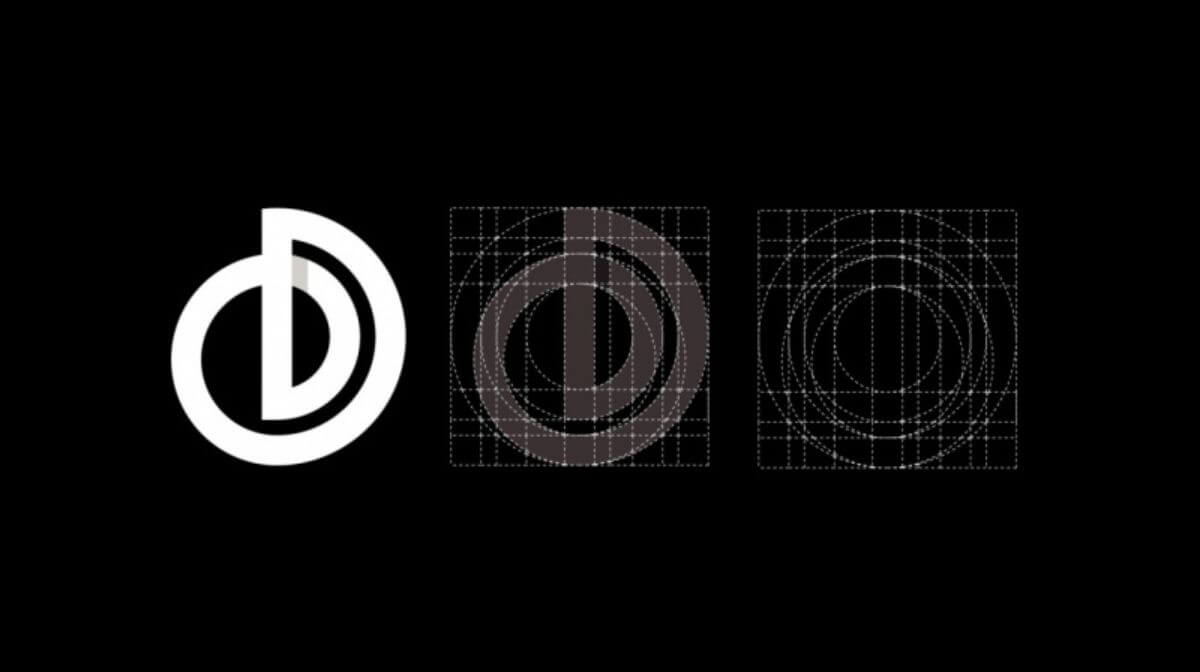
Are you struggling with designing monogram logos? Worry not! In this comprehensive video, I’ll address common questions about monogram design, such as determining the number of lines needed and achieving perfect logo letters. In this blog, you’ll be equipped to create stunning logos using polygons, circles, shields, or any shape you desire. Let’s dive in and uncover the secrets to crafting exceptional monogram logos.
Steps to create Monogram Logos:
Understanding Line Requirements
The key to a successful monogram logo lies in understanding the number of lines required. To address this, I’ve created a separate video dedicated to this crucial aspect. You’ll find a link in the description that leads you to the video. By watching it, you’ll gain clarity on how to determine the precise number of lines needed for your logo.
Crafting a Shield Monogram
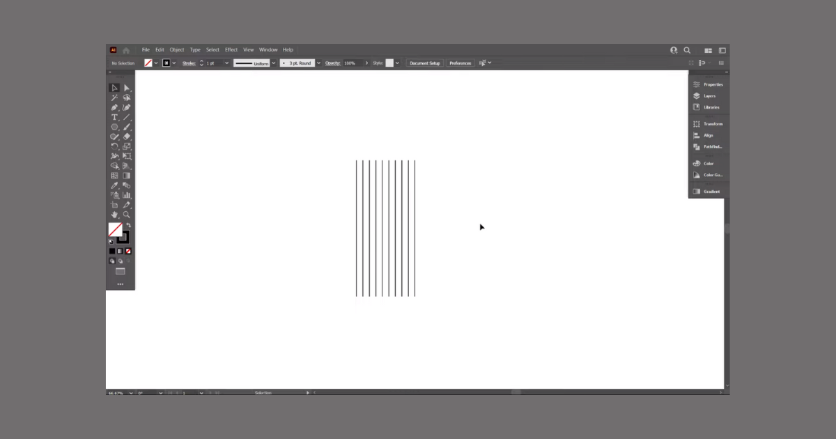
Now, let’s get down to designing your monogram logo within a shield. Start by typing out the letters you intend to use. With the foundational knowledge of line requirements, you’re well-prepared for this stage. Create 14 lines using the Line Segment tool and assign stroke colors to them. Align the lines to the bottom and group them for easy manipulation.
Constructing the Shield Frame
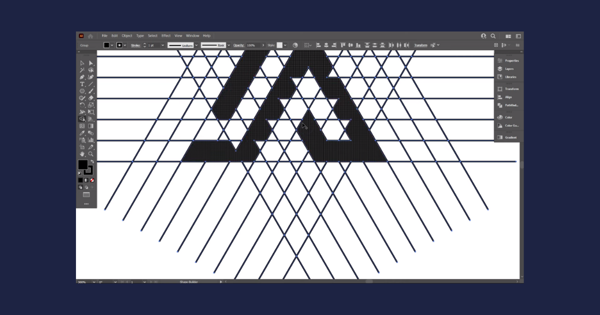
Copy the lines and paste them in place. Rotate this set of lines by 90 degrees to create the basis for your monogram design. This framework is pivotal for crafting the monogram logo.
Designing the Shield Shape
Craft the shield shape using the Pen tool or opt for pre-made shield designs available online. Align the shield accurately with the lines, ensuring it fits seamlessly into the framework you’ve established.
Designing the Monogram Letters
Select everything and utilize the Shape Builder tool. Draw the letters of your monogram logo directly onto the lines. Carefully place each letter, making sure they don’t intersect with one another. Remember, precision is key in creating a polished monogram.
Adjusting and Enhancing the Design
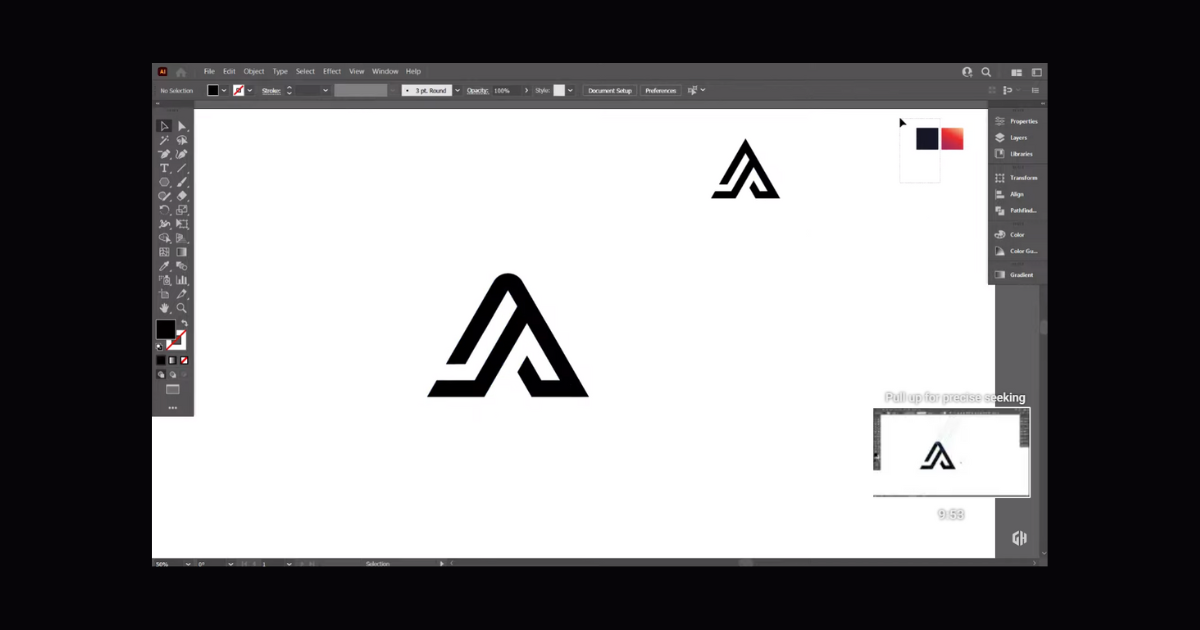
Once the letters are in place, move the entire design away from the lines. To avoid any difficulties in moving the design, ungroup it first before adjusting its position.
Adding Depth and Professionalism
Elevate your design by increasing the stroke color of the letters. Typically, a stroke of 6pt enhances the logo’s appearance significantly. With the design selected, go to Object > Expand and then to Pathfinder to unify the design.
Exploring Other Shapes
While the shield monogram is a classic choice, you can venture into other shapes. The same principles apply: determine the number of lines required, construct the shape, and design the letters with precision. For example, using a polygon, you can replicate the process by rotating lines at specific angles to form the shape.
Refining the Design
Enhance the spacing between letters by adjusting the stroke color of the design. Increasing it to 4pt is a good starting point. Expand the design and unite it using Pathfinder. Center-align the design to maintain a balanced look.
Adding Final Touches
Increase the spacing between the letters and the shield by adjusting the stroke color to 9pt. Expanding the shield’s stroke and uniting it with the letters create a cohesive monogram.
You’ve just unlocked the secrets to mastering monogram logo design. Armed with the knowledge of line requirements and precise placement, you can confidently create monogram logos within various shapes. Whether it’s a shield, a polygon, or another frame, you have the skills to make your logos stand out. Remember, attention to detail and craftsmanship play a crucial role in achieving professional results. By following these steps, you’ll be well on your way to crafting stunning monogram logos that captivate and impress.
Frequently Asked Questions (FAQs)
Is Adobe Illustrator best for logo design?
Adobe Illustrator is ideal for any logo, icon, or graphic design project.
What is the best size for the logo?
It ranges between 250 to 400 pixels wide.
Is it easy to use Adobe Illustrator?
Adobe Illustrator is a powerful tool, but it will be difficult to use without the proper knowledge and understanding of design principles.
Related Article: