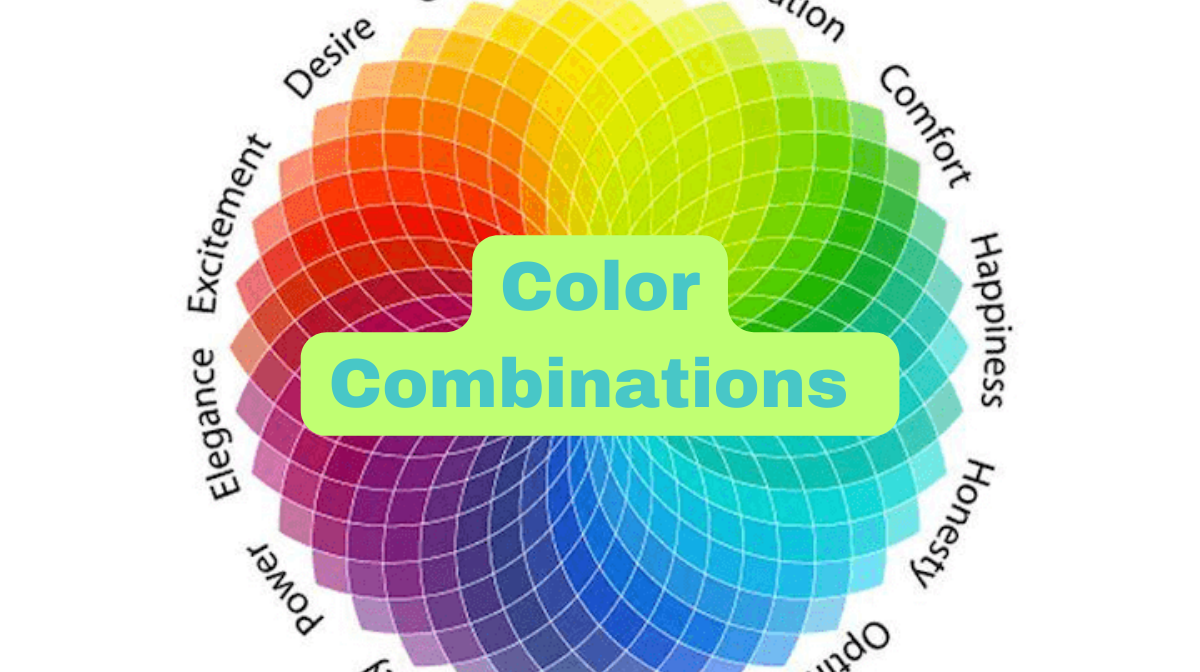
In today’s digital world, logos are like a company’s signature. They represent its identity and values. And in the world of logo design, one element reigns supreme: color. The color combination can trigger emotions, convey messages, and etch a brand into people’s minds. In this blog, Let’s explore the art of color combinations in logo design and how they wield their visual impact.
Understanding the Emotional Magic of Color Combinations
Before we dive into color mixing, let’s peek at the emotions colors stir:
Red: Passion and Energy
Red ignites feelings of love, anger, and excitement. It’s the go-to color for expressing passion and vitality.
Blue: Trust and Professionalism
Blue emanates trust and professionalism. No wonder it’s a corporate favorite, radiating reliability.
Yellow: Optimism and Clarity
Yellow beams with optimism and clarity. Brands use it to sprinkle happiness and positivity into their image.
Green: Growth and Eco-Friendliness
Green embodies growth and eco-friendliness. It’s the badge of honor for sustainability champions.

The Art of Mixing Colors
Creating a compelling logo often involves a blend of colors to convey nuanced messages. Here’s the recipe:
Complementary Colors
Imagine putting red and green, or blue and orange, side by side. The result? A striking, eye-catching contrast.
Analogous Colors
If you favor colors next to each other on the wheel, like blue and purple or yellow and green, you’ll create a harmonious, pleasing vibe.
Triadic Colors
Picking three evenly spaced colors on the wheel, say red, blue, and yellow, will yield a balanced, dynamic composition.
Monochromatic Colors
Stick to various shades of one color, like different blues. This signifies sophistication and simplicity.
Real-Life Examples: Iconic Logos
Now, let’s dissect some legendary logos:
Apple
Apple keeps it simple with a monochromatic silver apple. It embodies elegance, innovation, and simplicity.
McDonald’s
McDonald’s blends red and yellow for a vibrant, energetic look that appeals to all ages.
Starbucks
Starbucks pairs green and black to emphasize its commitment to sustainability and quality.
The Need for Versatility
When choosing logo colors, remember they must shine everywhere, from screens to print. A well-thought color scheme should remain consistent and recognizable, no matter where it appears.
In logo design, the power of color combinations can’t be underestimated. Understanding the psychology of colors and how to mix them is the secret sauce for creating logos that stick with your audience. So, get creative and let your brand’s true colors shine.
Frequently Asked Questions (FAQs)
How do colors in a logo affect consumer perception?
Colors can influence emotions and perceptions. For example, red may convey excitement, while blue suggests trustworthiness.
What are complementary colors, and how can I use them effectively in my logo design?
Complementary colors are opposites on the color wheel (e.g., red and green). They create contrast and can make a logo visually striking.
Can you provide examples of famous logos with excellent color combinations?
Sure, examples include McDonald’s (red and yellow for vibrancy) and Starbucks (green and black for eco-friendliness and quality).
Are there cultural considerations when choosing logo colors for a global audience?
Yes, colors can have different meanings in various cultures, so it’s essential to research and ensure your choices align with your target audience.
What’s the significance of color versatility in logo design, especially for digital and print media?
Answer: Versatility ensures your logo remains effective and recognizable in various contexts, from digital screens to printed materials, maintaining brand consistency.
Related Articles:


