Hey there, font enthusiasts! We’re examining what makes the ideal typeface for your brand or project today as we go deeply into the variety of fonts. I’m Dominic, and this is “What is the Best Font?”
In branding and design, fonts have always been crucial, and in the current digital era, they are much more crucial. Choosing the appropriate font is an important choice whether you’re developing a website or Instagram posts. However, it’s not as simple as scrolling through a list and picking one at random. Fonts may make or break your design because of their distinctive qualities and complexities.
In this blog post, I’ll walk you through the crucial factors to take into account when selecting a typeface and provide you with a useful checklist to assist you.
Match the Character
The first thing to consider is the character of the font. Fonts come in various styles, from rounded and crisp to groovy and sharp. Some fonts, like Addington CF or Avondale, exude classic elegance, while others, such as Deutschland or modern sans-serif fonts, convey a sleek and contemporary vibe. Your font choice should align with the character of your brand or project.

Range of Weights and Styles
Next up is versatility. You’ll want a font that offers a range of weights and styles. This adaptability is crucial in today’s design environment, as you might be required to adjust your text to multiple design components, print sizes, or dimensions of screens. Look for fonts that provide options from thin to bold, ensuring you have the tools to express yourself effectively.
Complete Character Set
Don’t overlook the importance of a comprehensive character set. Ensure that your chosen font includes both uppercase and lowercase letters, numbers, punctuation marks, and symbols. It’s easy to overlook this, but it’s crucial for a smooth design process.
Web Safe Fonts
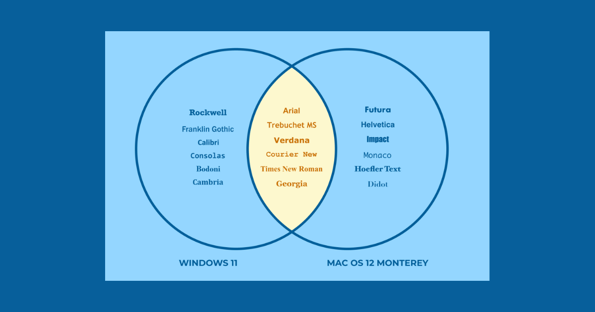
Web compatibility is a critical factor. Not all fonts come preinstalled on devices, so you must choose a font that is web-safe. You can easily check this by looking for fonts in libraries or using websites like HubSpot’s list of web-safe fonts. The last thing you want is for your carefully selected font to be replaced by a generic one on users’ devices.

Legibility and Accessibility
Last but certainly not least, consider legibility and accessibility. Fonts serve a fundamental purpose: to convey information effectively. Think about your audience, including those with poor vision or neurodivergent individuals. Fonts like Airbnb’s custom font prioritize legibility with carefully designed characters and clean strokes. Helvetica, a timeless choice, has been continually refined for readability.
In a nutshell, there is no universally applicable response to the query “What is the best font?” Your brand’s personality, your demand for versatility, the character set’s completeness, web compatibility, and legibility will all influence the ideal font for you.
Take your time, look through many typefaces, and use this checklist to help you decide. Whether it’s a classic like Helvetica or a bespoke font tailored to your brand, remember that your font choice can have a significant impact on how your message is received.
Frequently Asked Questions (FAQs)
What role do fonts play in branding?
Fonts play a crucial role in branding as they convey the personality, values, and identity of a brand. The right font choice can evoke specific emotions, establish brand recognition, and help communicate the brand’s message effectively. Consistency in font usage across all brand materials is essential for building a strong and memorable brand image.
How do I choose the best fonts for my brand?
To choose the best fonts for your brand, start by defining your brand’s personality and target audience. Consider factors like whether your brand is modern, classic, playful, or formal. Then, select fonts that align with these characteristics. Additionally, ensure readability and versatility, as your chosen fonts will be used across various media, from logos to websites and marketing materials.
Should I use custom fonts or readily available fonts for my brand?
The decision between custom and readily available fonts depends on your brand’s budget, goals, and uniqueness. Custom fonts offer exclusivity but can be costly to design and may not be as versatile. Readily available fonts are more affordable and readily accessible, but they might be less unique. In some cases, a combination of both custom and readily available fonts can strike the right balance.
How many fonts should I use in my brand identity?
It’s generally recommended to use a limited number of fonts in your brand identity to maintain consistency and coherence. A common practice is to use two or three fonts—one for headlines, one for body text, and possibly another for special purposes like logos or slogans. Using too many fonts can confuse your audience and dilute your brand’s identity, so it’s best to keep it simple and focused.
Related Articles:


