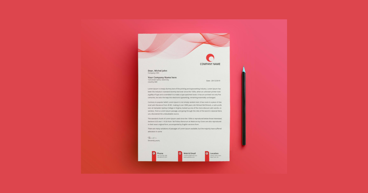
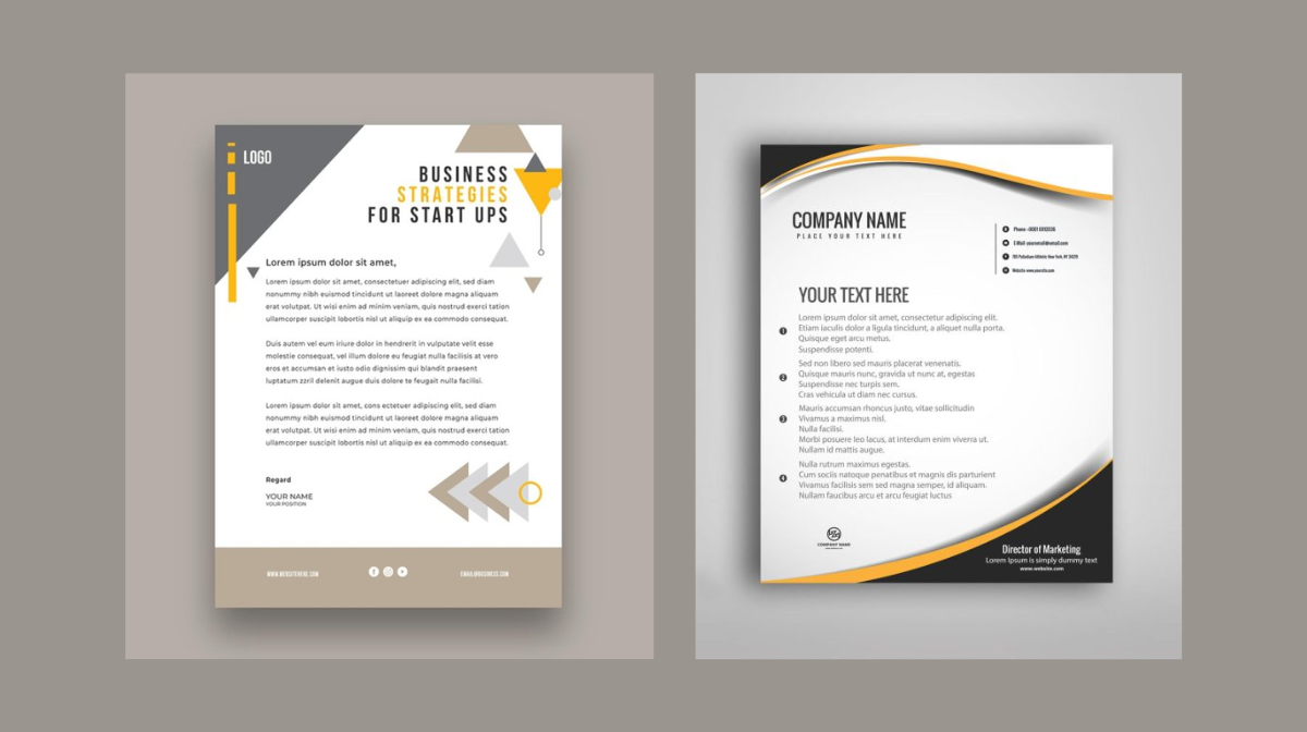
Hello, design lovers and brand enthusiasts! In this blog we’re embarking on a journey into the heart of design, exploring a seemingly small yet mighty field of branding – the world of letterhead design. Buckle up as we uncover the secrets behind how these seemingly humble pieces of stationery can wield a significant influence on how your brand is perceived.
First Impressions That Speak Volumes
Picture this: you receive a letter. One is on a plain, uninspiring sheet; the other boasts a beautifully crafted letterhead. Can you feel the difference? That’s the magic of a well-thought-out letterhead. It’s not just paper; it’s your brand’s first hello, signaling to the world that you mean business in the best possible way.

The Visual Symphony of Consistency
Consistency is key in any relationship, and your brand’s relationship with your audience is no exception. Your letterhead is like the visual heartbeat of your brand. Throw in your logo, splash some brand colors, and let your typography dance to the beat. The result? A symphony of visuals that screams “This is us!” It’s not just about looking good; it’s about making your brand unforgettable.
More Than Just Pretty: Practicality in Design
Sure, a letterhead has to look good, but it’s not all about aesthetics. It’s got a job to do, too. Make it work for you by including vital details – your company name, logo, address, and contact information. These elements not only add a touch of professionalism but also serve as a roadmap for anyone wanting to connect with you. Functionality meets flair!
Adapting to the Times: Print vs. Pixels
In this digital age, our letterheads aren’t confined to the printed page. Say hello to email signatures and digital letterheads! They’re the modern cousins of their ink-on-paper counterparts. The trick here is making sure they’re cut from the same visual cloth, creating a seamless brand experience whether your message lands in a mailbox or inbox.
The Ripple Effect: Your Letterhead Design Ripples Through Brand Perception
Every email, every letter is a brushstroke in the grand canvas of your brand’s story. A well-designed letterhead whispers professionalism, care, and an unwavering commitment to quality. On the flip side, a lackluster one might accidentally convey a different story. In the business of design, these details add up to the symphony of your brand’s success.
In closing, fellow designers and brand champions, let’s take a moment to appreciate the unsung hero – the letterhead. It’s not just stationery; it’s a powerful storyteller in the grand narrative of your brand’s identity. So, as you embark on your next design adventure, remember: that every detail matters, and your letterhead is the opening chapter in the book of your brand. Here’s to making it a bestseller!
Frequently Asked Questions (FAQs)
Why is letterhead design important for a brand?
Letterhead design is crucial as it creates a visual identity, conveying professionalism and consistency for brand recognition.
What elements should be included in an effective letterhead design?
An effective letterhead design should include the company logo, name, address, contact details, and consistent brand colors and typography.
How does a well-crafted letterhead contribute to brand perception?
A well-crafted letterhead positively influences brand perception by signaling attention to detail, professionalism, and a commitment to quality.
In the digital age, why does digital letterhead design matter?
A: Digital letterhead design matters to maintain a cohesive brand image across both physical and virtual communication channels, including email signatures and digital documents.
Can a creative and unique letterhead design enhance brand memorability?
Yes, a creative and unique letterhead design can significantly enhance brand memorability by making a lasting impression on recipients and fostering a distinctive brand identity.
Related Article:
Letterhead Design: Tips for Crafting an Impressive Letterhead.


