
Hello design enthusiasts! Today’s discussion is all about the art of business card design, and I’ve got some golden rules that will elevate your card game to new heights. This video is brought to you by Namecheap, the go-to platform for domain needs. Stay tuned to discover more about grabbing a stellar deal for your website project!
Branding Brilliance
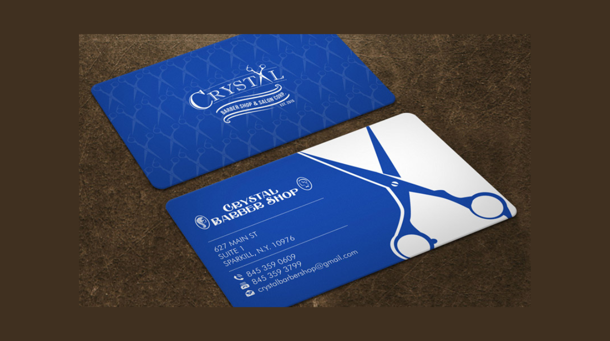
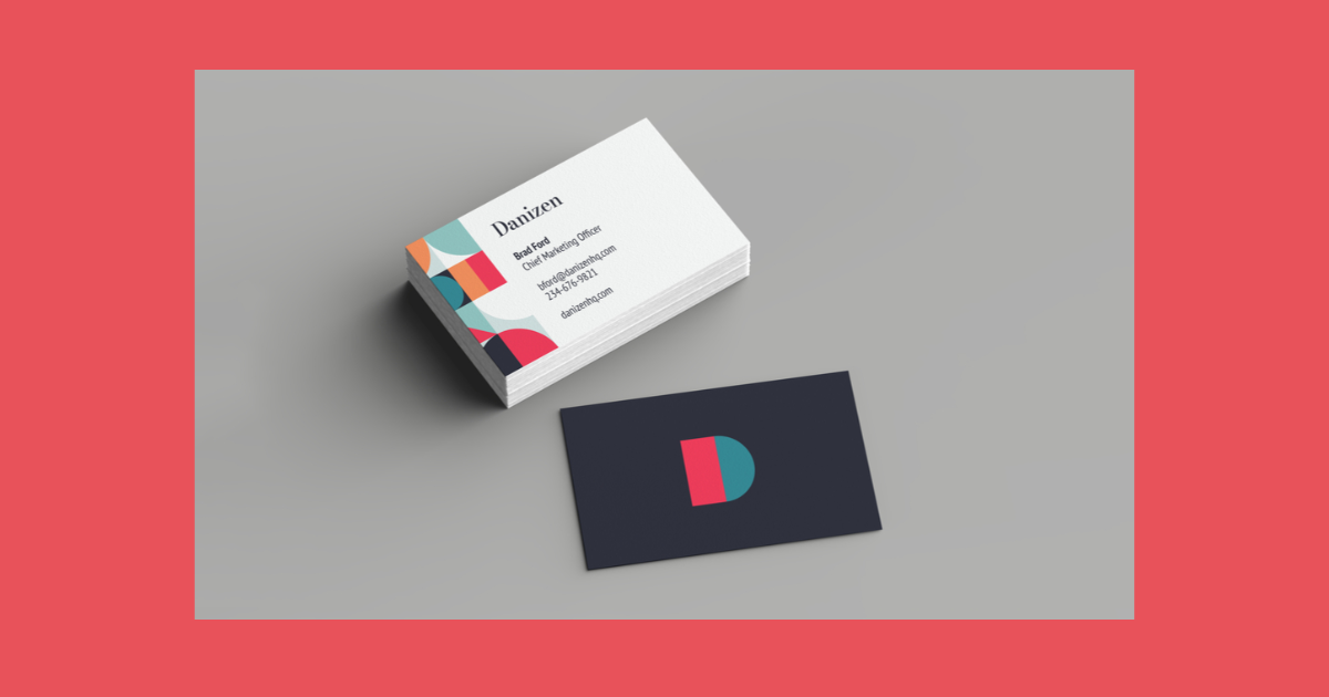
When diving into business card design, the first rule is to embrace the power of branding. From colors and typefaces to layout and logos, ensure your business card resonates with the overall theme and message of your brand. Think of it as a mini representation of your brand identity.
Harmonious Contrast in Business Card
To achieve a visually striking business card, leverage contrasting colors. Whether on the front or back, maintaining a consistent theme throughout is key. Lay two cards side by side, and they should complement each other seamlessly. Experiment with colors that pop and create a lasting impression.
Readability Reigns
Text is the heart of your business card, so prioritize readability. Test print your design and check if the text is legible at a reasonable distance. Ensure there’s no blurriness or loss of clarity after printing. Remember, the goal is for people to easily absorb the information on your card.
Print-Ready Precision
The third golden rule revolves around printing specifications. Ensure your business card is set to a resolution of 300 DPI (dots per inch) for optimal print quality. Don’t overlook this crucial detail, as it can impact the overall clarity and sharpness of your design.
Bleeds for Seamless Cuts
Setting up bleeds is rule number four. A 5-millimeter bleed around the entire design, configured in Illustrator, facilitates efficient cutting during the printing process. This ensures your business cards come out seamlessly, with no awkward white edges.

Margins for Tidy Elegance
Maintain a polished and tidy look by incorporating margins. Bring them in around 5 millimeters from the cut-out edge to avoid a cluttered appearance. Keeping content within the margins adds a touch of sophistication to your design, steering clear of a haphazard look.
Hierarchy: Let Important Info Shine
The final golden rule emphasizes hierarchy. Ensure vital information, especially titles, stands out prominently. Whether you’re an art director or another professional, let hierarchy guide the viewer’s eyes to the most important details on your business card.
Now, a quick shoutout to our sponsor, Namecheap! They’re not just about domains – they offer a range of services, including shared web hosting, WordPress hosting management, SSL certificates, and more. Check out the link in the description box for exclusive discounts on your next website project.
Frequently Asked Questions (FAQs)
What key elements should I include in my business card design?
Your business card should feature essential elements such as your logo, contact details (phone, email, address), and job title. Incorporate your brand colors and maintain a clean layout for a professional look.
How can I ensure my business card is visually appealing and stands out?
To make your business card visually appealing, use contrasting colors, maintain a consistent theme, and leverage eye-catching design elements. Experiment with fonts but prioritize readability, and consider unique finishes like spot UV or rounded corners for added flair.
Is there a specific resolution I should use for my business card design?
Yes, it’s crucial to set your business card design to a resolution of 300 DPI (dots per inch) for optimal print quality. This ensures that your design appears sharp and clear when printed, avoiding any pixelation or blurriness.
Why are bleeds and margins important in business card design?
Bleeds (typically 5mm around the design) are essential to ensure that the printer can cut your business cards precisely, avoiding any white edges. Margins (around 5mm from the cut-out edge) add a touch of elegance, preventing a cluttered appearance and maintaining a polished, professional look.
Related Articles:


