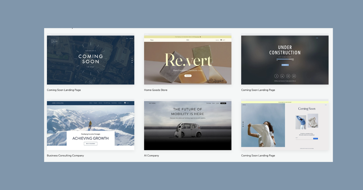
Hey, fellow website creator! If you’ve just embarked on the adventure of crafting your very first website using Wix, you’re in for a treat. But let’s be real: getting the design just right can be a bit tricky. Fear not, though! In this blog post, we’re going to dive into some super-helpful tips to make your website look like a work of art—and trust me, it’s way easier than you think.
Keep Colors Simple and Sweet on your Website
Back in the day, my first websites looked like a crazy mix of ’90s colors and weird rainbows. Lesson learned: less is more. If you’re just starting, go for a clean look. Pick one main color and use black or white for the background. This not only makes things look neat but also guides your visitors to the important stuff on your page.

Make Colors Play Nice Together
Colors need to get along for your site to look good. If you have a dark background, go for lighter text, and if it’s the other way around, choose darker text. It’s like creating a cool color harmony dance. Experiment a bit until you find the combo that works and makes your site pop.
Give Your Page Some Breathing Space
Ever heard of whitespace? It’s the magic ingredient that makes your page look clean and organized. Don’t stuff too much into your page; let things breathe a bit. Simplicity is key for visitors to smoothly move around and take in your awesome content.
Aim for a Balanced and Harmonious Look
Imagine your site as a perfectly balanced seesaw—that’s what symmetry does. Make sure things are lined up nicely, and there’s equal space between them. Also, guide your visitors through your site in a way that feels natural, like a well-choreographed dance. Trust me, it makes your site way more enjoyable to explore.
Show Off Awesome Images
A website without good images is like a pizza without cheese—something’s missing. Use high-quality images that match your vibe. You can grab cool pics from places like Pexels and Unsplash, or, if you’re feeling fancy, use your photos. Just remember to tweak and edit them so they fit seamlessly into your design.

In a nutshell, building a rad website on Wix is like painting a masterpiece—it takes a bit of finesse, but the result is worth it. So, try out these tips, make your site look incredible, and let your creativity shine online! Happy designing!
Related Article:


