Are you looking to design a modern and sleek logo with individual letters? Look no further! In this tutorial, I’ll walk you through the entire process of crafting a contemporary logo that captures attention. Whether you’re a seasoned designer or just getting started, follow along closely and discover the valuable insights hidden within this tutorial.
Typography and Initial Setup
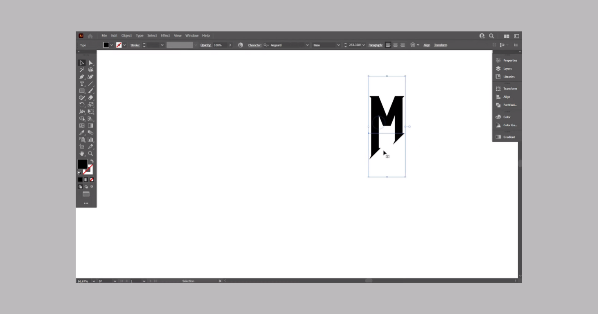
To begin, choose the letter you want to design for your logo. Make sure you’re using the Asgard font for a polished look. Use the Line Segment tool to draw a straight line and assign it a stroke color. Duplicate the line by holding the “Alt” key and pressing “D,” creating a total of four lines.
Creating the Base Structure
Select the lines and align them to form the base structure. Copy the lines using the “Edit” menu and then “Paste in Place.” Rotate the duplicated lines by 90 degrees to create a cross-like shape. This cross will serve as the foundation for your logo.
Fine-Tuning the Design
Now, copy the lines again and move them slightly to the side. Replicate the lines using the “Control+C” and “Control+F” shortcuts. Adjust the size of the top line to create variation. You can change the colors temporarily for better visibility. Delete any unnecessary lines to clean up the design.
Creating the Letter’s Form
Place the red lines onto the lines you’ve created, forming the structure for the letter. Rotate the red lines by 123 degrees for a dynamic touch. Align all the elements to the center for a balanced composition.
Reflection and Arrangement
Reflect the red lines to create symmetry. At this point, you’re crafting the letter “N.” Make sure the top lines match perfectly by adjusting their position if needed. With the lines aligned, switch back to normal mode and extend them slightly.
Building the Letter Shape
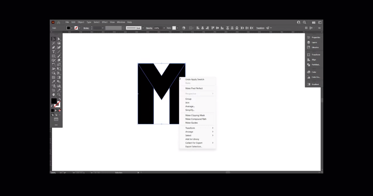
Select all the elements and use the Shape Builder tool. Draw shapes to form the letter “N.” Ensure the top and bottom parts are not joined. Group the letter for easier manipulation.
Integrating the Logo Elements
Position the “N” letter above the lines, making sure it’s centered. Turn off the stroke color for the letter to focus on its shape. Group the entire design for better organization.
Creating Background Elements
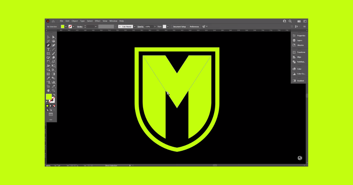
Use the Rectangle tool to draw a rectangle that matches the dimensions of the “M” letter. Adjust the opacity and color for better contrast. Modify the rectangle’s curve points to create a unique shape.
Adding Depth and Details
Reflect the curved shape to create a symmetric effect. Select everything and use the Shape Builder tool to create negative space within the background. Place the rectangular shape behind the design and adjust its stroke color to black.
Final Touches and Polish
Center everything on the artboard and increase the stroke color’s thickness to your liking. Convert the shield’s fill color to a stroke and outline its path. Use the Eyedropper tool to match the color of the “N” letter.
Finishing Touches
Draw a rectangle that covers the entire artboard and send it to the back. Use the Pen tool to create an abstract shape for additional detail. Adjust the color and opacity for a subtle touch.
Completion and Reflection
Congratulations! You’ve successfully designed a modern logo that’s both striking and visually appealing. This step-by-step guide ensures you’ve covered all the essential aspects of logo creation. Whether you’re a seasoned designer or a beginner, this tutorial provides valuable insights for creating compelling logos.
From typography selection to intricate detailing, you’ve learned how to craft a contemporary logo that stands out. By following this tutorial, you’ve gained valuable skills and techniques that empower you to create captivating logos. If you found this tutorial helpful, be sure to show your appreciation by liking the video and subscribing for more insightful content. Thank you for joining us on this creative journey!
Frequently Asked Questions (FAQs)
What are the different types of grids for logo design?
Classic square, the unique square, and the advanced rectangle system.
Why do designers use grids?
Designers use grids to establish a set of guidelines for how elements should be positioned within a layout.
What is a grid logo?
The lines on grids are used to inspire shapes and can unlock the potential for geometric emblems that wouldn’t be possible using freehand.
Related Article: