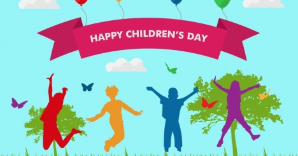
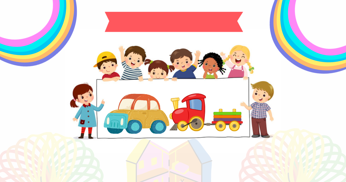
Hey, fellow designers! Today, we’re diving into the whimsical world of web banner design for kids’ websites. Buckle up for a joyous ride as we explore some fantastic tips to make your banners pop with color, characters, and all things kiddie-cool!
Understanding the Banners’s Little VIPs
First things first, let’s get into the mindset of our tiny audience. What makes them giggle? What colors make their eyes widen with excitement? Think rainbows, unicorns, and all the fantastic wonders that make childhood magical.
Let the Imagination Run Wild
Ready for some creative play? Infuse your banners with playful graphics and lively cartoons. Think about characters that can become instant friends for our little visitors. Whether it’s animated animals, superheroes, or friendly aliens, let your imagination soar.
Splash of Colors
Time to paint the canvas with a burst of colors! Primary colors or soft pastels are your go-to pals. They bring life to your banners and create a visual feast that kids will adore.

Font Play
Now, let’s talk fonts. Keep it simple, keep it fun! Choose fonts that look like they jumped straight out of a storybook – easy to read, playful, and kid-approved.
Short and Sweet Messages
Kids are on the move, so keep your text short, snappy, and to the point. Craft catchy phrases or simple language that makes them smile. Big, readable fonts are your secret weapon here.
Interactive Magic
What’s more exciting than clicking on and seeing something cool happen? Make your banners interactive with clickable elements or animated characters. It’s like a mini adventure with every click!
Fits Every Screen
Our little buddies use all kinds of devices – from tablets to PCs. Make sure your banner looks awesome on each one. Responsiveness is the key to keeping the fun alive, no matter the screen size.
Stay in the Family
Let’s keep it in the family, design-wise. Match your style with the overall vibe of the kids’ website. Consistency is the name of the game.
Testing, Testing, 1-2-3
Before you break out the confetti, give your banner a test run. Ask the experts – aka kids – or get some feedback from parents and teachers. It’s like a sneak peek before the big show.
Keep it Legal and Safe
Last but not least, a little reminder to play by the rules. If your site is all about the little ones, check out regulations like COPPA to keep things safe and sound.
Wrap-Up
And there you have it, design champs! Crafting for kids is a chance to sprinkle a bit of magic into their online world. So go ahead, let those creative juices flow, and create banners that not only catch the eye but also make web adventures a delight for our pint-sized pals.
Frequently Asked Questions (FAQs)
What makes a web banner kid-friendly?
Vibrant colors, playful imagery, and simple messaging appeal to kids.
Are there design guidelines for children’s web banners?
Yes, clarity, larger fonts, and interactive elements enhance engagement.
How can I ensure safety in kid-friendly design?
Adherence to strict privacy policies and age-appropriate content is crucial.
What dimensions suit kid-friendly web banners?
Standard sizes like 300x250px or 728x90px are commonly effective.
Related Article:


