
Welcome back, design enthusiasts! Today, we’re taking a closer look at the fascinating world of packaging design, focusing on a delectable treat: the peanut bar. In the next few minutes, we’ll explore the creative process behind crafting a visually appealing and cohesive packaging identity for a range of peanut bars with different ingredients. So, let’s dive in and see how this delightful transformation unfolds!
Finding the Perfect Packaging Identity:
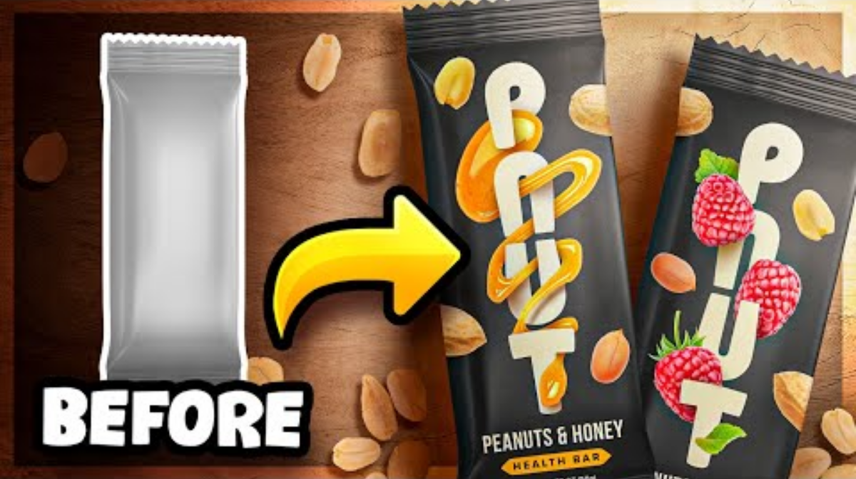
First things first, we need a name for our peanut bar company, something that resonates with the product and its essence. The chosen name? “Just Nuts.” Simple, yet catchy.
Crafting a Striking Logo:
A memorable logo is the cornerstone of any successful packaging. We opt for a geometric and bold design resembling two halves of a peanut. This design choice not only stands out on small packaging but also cleverly hints at the product inside.
We refine the logo, rounding off sharp corners to infuse a touch of organic appeal. The final logo, versatile enough to fit both horizontal and vertical orientations, forms the heart of our branding strategy.

Creating Visual Cohesion:
To tie our diverse peanut bars together visually, we decided on a base black color for all the packages. The “Just Nuts” logo, instead of being stark white, adopts a subtle honey hue, adding a touch of intrigue. Each bar features a peanut base but incorporates one or two extra ingredients unique to its flavor profile.
Infusing Ingredients into Design:
For one of our bars, featuring honey as a key ingredient, we creatively integrate honey visuals into the packaging. A mesmerizing honey drip intertwines with the letters of the brand, adding a touch of sweetness to the overall design. To represent the peanuts, we strategically place images of different peanut pieces across the package, ensuring even distribution and natural lighting effects for a realistic touch.
Incorporating Informative Elements:
Informing customers about the main ingredients is essential. We added a section below the logo detailing the key components of each bar. A subtle tagline emphasizes the health-conscious nature of the product, underlining its nutritional value.

The Final Touch:
Finally, with a consistent layout, cohesive color schemes, and visually appealing imagery, our peanut bars are ready to hit the shelves. Each bar maintains its distinct identity while being part of the “Just Nuts” family.
And there you have it, the creative journey of transforming a simple peanut bar into an enticing and visually appealing product. We hope you enjoyed this glimpse into the art of packaging design. If you’re interested in more design-related content, don’t forget to subscribe for future updates. Feel free to check out the linked assets in the description for your creative projects. Thank you for joining us today, and until next time, happy designing!
Frequently Asked Questions (FAQs)
Why is a compelling logo important for my peanut bar brand?
A compelling logo is the face of your brand, creating a memorable visual identity that sets you apart from competitors. It represents your brand’s essence, values, and quality. A well-designed logo for your peanut bar not only attracts customers but also establishes a strong brand presence, fostering brand loyalty.
How can I create a logo that reflects the essence of my peanut bar brand?
Start by understanding your brand personality and target audience. Reflect the essence of peanuts and the bar’s uniqueness in your logo design. Consider elements like peanuts, honey drips, or other key ingredients. Choose colors that evoke freshness and health. A skilled designer can help bring your vision to life, ensuring your logo resonates with your brand’s identity.
What role does packaging design play in the success of my peanut bar product?
Packaging design is vital for several reasons. It not only protects your product but also communicates essential information to consumers, such as ingredients and nutritional value. Visually appealing packaging attracts customers, encouraging them to make a purchase.
How can I ensure my peanut bar packaging design is both attractive and informative?
Balance is key. Focus on a clean, eye-catching layout that incorporates your logo prominently. Use high-quality images of peanuts or other ingredients to add visual appeal. Clearly display key information such as ingredients, nutritional facts, and any unique selling points.
Related Article:
Packaging Design: Eye-Catching and Eco-Friendly Tips.