Hello, creative minds! We’re exploring the intriguing realm of logo design today. In this blog post, we’ll show you how to create a modern, clean logo that also incorporates eye-catching gradient colors. Grab your design hat, pay close attention, and don’t forget to remark with your opinions!
Getting Started
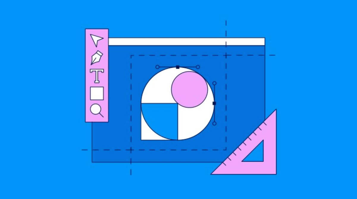
Let’s begin our creative journey. To create this modern logo, we’ll use a simple and effective approach. First, grab your trusty shape tool and start by drawing a circle. It’s the foundation of our design.
Now, for a nifty trick: Duplicate the circle. You can easily do this by selecting the circle, copying it, and then pasting it in place. Once you’ve got your copy, make it slightly smaller than the original. This is where our logo starts to take shape.

Aligning the Elements
To achieve a balanced design, it’s crucial to align our elements. Use the Align Segment Tool to draw a line connecting the tops of both circles and another one connecting their bottoms. This step adds structure to our logo.
Next, select all the elements you’ve created so far and group them together. To give our logo a dynamic edge, rotate it by 45 degrees. If you want to create multiple copies, simply follow the same method of copying and rotating. Quick tip: keyboard shortcuts like Ctrl+C and Ctrl+F make this a breeze.
Adding Gradient Colors
Now, let’s infuse some life into our design with vibrant gradient colors. To do this, select your logo and use the Shape Builder Tool. This is where your creative flair can shine. Change the color of your choice and start drawing shapes within your logo. Be precise; this step is crucial for achieving a polished look.
Remember, details matter. Take your time and ensure your design is spot on. If you happen to miss a mark or need to fine-tune, no worries! Just ungroup all the elements and make the necessary adjustments. Your design is taking shape beautifully.

Perfecting the Design
As you refine your design, you’ll notice it coming to life with the added gradient colors. By using Ctrl+Y, you can switch to outline mode if some items aren’t completely aligned. You can adjust every aspect of your design using this view until it looks perfect.
When you are happy with your logo, return to regular mode (Ctrl+Y) and save your creation.
Completing Your Logo Design
This logo design tutorial offers a creative framework. If you encounter challenges or if your design isn’t aligning as you’d like, don’t fret. You have the freedom to adapt and place each design part precisely where you want them.
In summary, we’ve embarked on a creative journey to design a modern logo infused with gradient colors. Through simple steps and precise detailing, your logo can become a visual masterpiece. So, keep experimenting, and remember that creativity knows no bounds.
And that’s a wrap for today’s logo design adventure! We hope you’ve enjoyed this tutorial. Feel free to share your thoughts and questions in the comments section below. Happy designing!
Frequently Asked Questions (FAQs)
Are circles good for logos?
Circles are clean, simple, and recognizable, circles are versatile, and aesthetically pleasing, which makes them a great choice for any industry.
What are the circles in a logo?
Shapes such as circles, ovals, and ellipses are a symbol of stability and collaboration.
Which logo style is best?
Combination logos are fantastic for new businesses that want the benefits of both a unique typography and a unique symbol.
Related Articles:
How Shapes Influence Brand Logo? Easy Guide
Logo Designing Helps Transforming Your Business.