Hello design enthusiasts! Ever wondered why some print designs look crisp and professional while others fall flat? Today, we’re unlocking the secrets of print, and I’ve got six game-changing tips to ensure your prints are nothing short of perfection. Let’s dive in!
The Black Magic: Rich Blacks vs. Standard Blacks
Ah, the color black—one of the unsung heroes of graphic design. Did you know there’s more than one way to create black in the design world? But when it comes to print, rich blacks steal the show. Unlike the regular black printed with just the black toner, rich black combines CMYK colors, adding depth and richness. Opt for rich black for large black areas and typography headings, while standard black suits body text to maintain crispness.
Billboard Brilliance: Resolutions and Tricks
Now, let’s talk billboards. Unlike small prints, billboards don’t need super high resolutions. While we usually set print projects at 300 DPI, a billboard, viewed from a distance, only needs around 20 PPI. Here’s a trick: to handle large designs without slowing your device, design at a smaller scale with higher resolution, then scale it up when sending it to the printer. Smart, right?

Proofing Perfection: The Art of Double-Checking
Nothing ruins a design like a sneaky typo or misplaced element. Tip number three: proof your print design thoroughly. Check for typos, ensure everything’s in its place, and eliminate any rogue objects. Once you’re satisfied, send it to the printer with a request for one proof print copy. Avoid a sea of printed copies with unexpected color issues—double-check before the mass print!
Printer-Friendly Files: Understanding Formats and Presets
Printers have their preferences, especially when it comes to file formats. PDF is the industry standard, but there are specific presets for compression, fonts, color management, and more. Contact your printer beforehand to learn their preferred format and preset for your specific print project. It’s the small details that make a big difference!
Font Design: Ensuring Fonts Play Nice
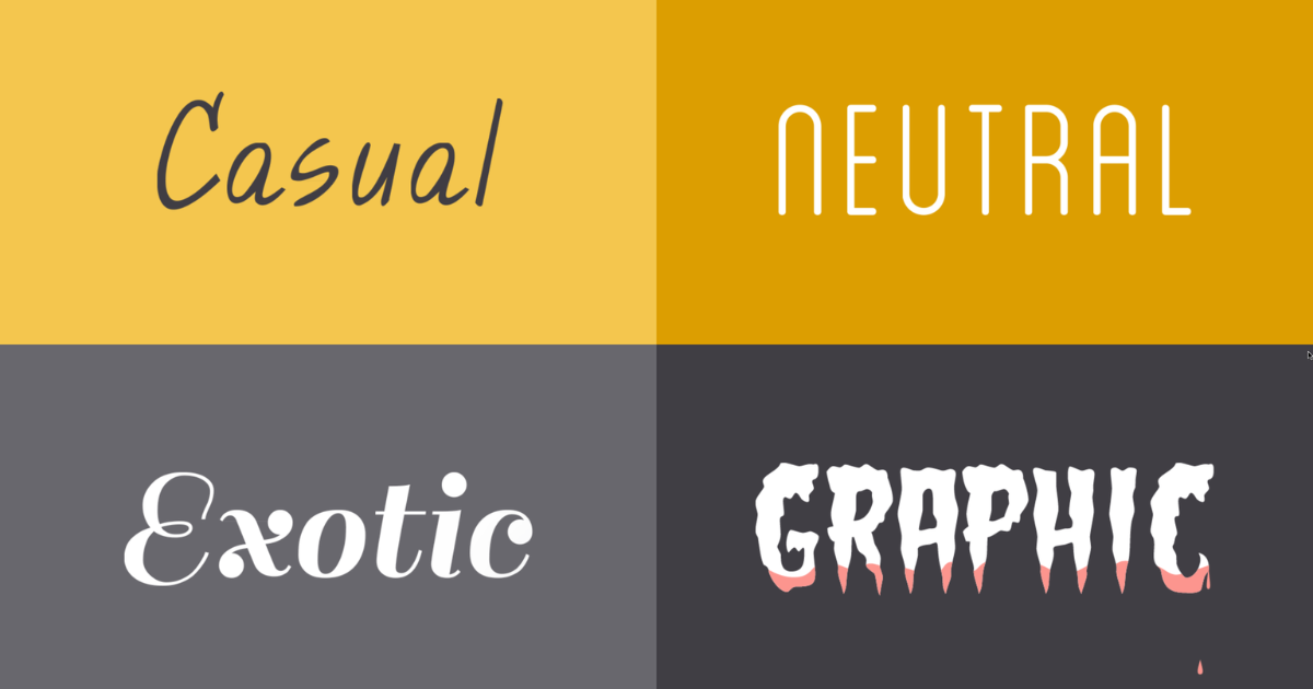
Using a unique font to make sure it doesn’t get lost in translation when it reaches the printer. Embedding fonts is the key. When exporting your design to PDF, check that handy message confirming font embedding. This ensures your carefully chosen typefaces make the journey from your computer to the printer seamlessly.

Bleeds: The Extra Edge for a Polished Finish
Last but not least, let’s talk about bleeds. A bleed is the extra area around your print document that gets trimmed away after printing to avoid unsightly edges. Set up bleeds easily in Illustrator or InDesign when creating a new document. A small bleed, like 5mm, is usually sufficient for most projects. Just let your design spill over the edge to ensure a clean, professional finish.
And there you have it—six tips to elevate your print designs from good to extraordinary. Remember, the devil is in the details, and these small considerations can make a world of difference. If you found these tips helpful, don’t forget to like, share, and subscribe for more design wisdom.
Frequently Asked Questions (FAQs)
What key elements should I consider in print?
Consider layout, typography, color schemes, and high-resolution images. Achieve visual balance for an impactful print design.
How can I ensure my print design is print-ready?
Ensure proper resolution (300 dpi), use CMYK color mode, include bleed areas, and convert text to outlines to avoid font issues.
What’s the significance of consistency in print?
Consistency in fonts, colors, and overall style maintains a cohesive brand image. It enhances recognition and professionalism in print materials.
How can I optimize images for print without compromising quality?
Use high-resolution images, preferably in TIFF or EPS format. Adjust image size without sacrificing clarity to achieve optimal print quality.
Related Articles:


