Ready to dive into the exciting world of graphic design? In this blog post, we’ll explore the step-by-step process of creating a captivating dark-themed poster using Photoshop. Whether you’re a seasoned designer or just starting out, these simple and effective techniques will help you bring your ideas to life.
Getting Started in Photoshop:
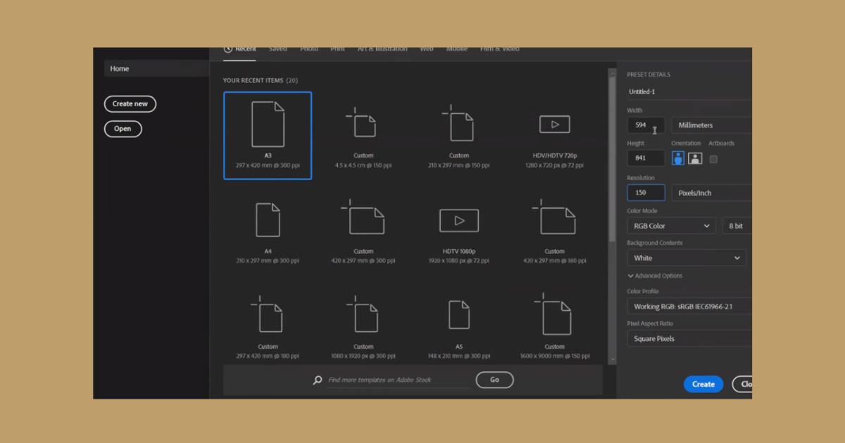
Fire up Photoshop and set the stage for your creative journey. Begin by creating a new document with dimensions set at 594 millimeters by 8.5 inches, providing a canvas where your imagination can unfold.

Organizing Your Materials:
Efficiency is key, so organize your plans, elevations, and rendered images in a dedicated folder. This not only streamlines your workflow but also allows you to easily choose from a variety of materials as you craft your masterpiece.
Brainstorming Board – A Blueprint for Success:
Before diving into Photoshop, take a moment to create a brainstorming board. Sketch out your ideas, outline the poster’s structure, and plan the placement of key elements. This thoughtful pre-design phase will significantly reduce the time spent on crafting your poster.
Crafting a Dark-themed Perspective Shot:
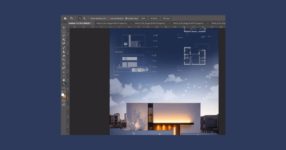
Start with a powerful perspective shot, opting for a dark theme this time. Extend the dark color of the sky under your shot to seamlessly blend it with the rest of the poster. Using layers and masks, finesse the edges to create a polished look.
Incorporating Text and Titles:
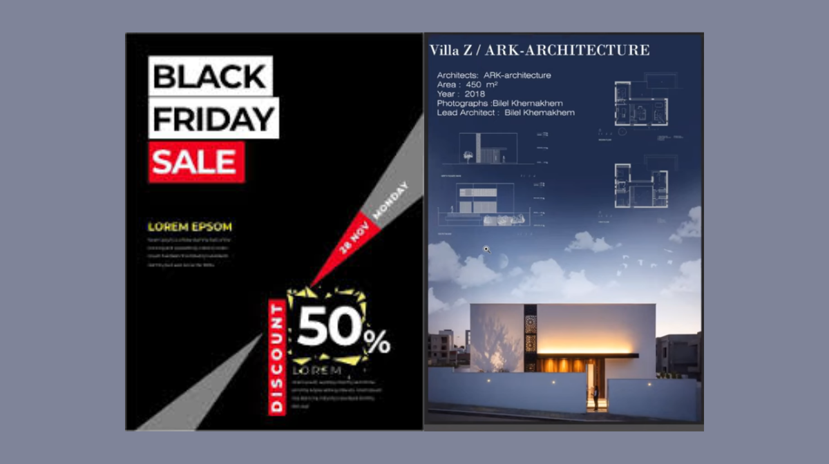
Place your title at the top of the poster using Photoshop’s text tool. Experiment with font size, style, and color to find the perfect balance. Add relevant text elements such as project details, architect information, and construction year, aligning them with your brainstorming board’s plan.
Integrating Plans and Elevations:
Incorporate your plans and elevations by removing any white backgrounds, inverting them to white, and placing them strategically on your poster. Pay attention to the overall composition and adjust sizes and placements as needed.
Adding Finishing Touches:
Enhance your poster with additional elements such as clouds, birds, or even a conceptual diagram. Play with layer styles, opacity, and blending modes to achieve a cohesive and visually striking result.

Exporting Your Masterpiece:
Once satisfied with your design, it’s time to export. Ensure all elements are high-quality for a professional finish. Set yourself apart by investing in detailed and well-crafted exports that convey the effort you’ve put into your creation.
The good things about Poster design:
Visual Impact: Posters capture attention through compelling visuals, making them highly effective for quick message delivery.
Cost-Effective: Offering an economical advertising solution, posters are budget-friendly and can be produced in various sizes for widespread distribution.
Versatility: Suitable for diverse purposes, from advertising to event promotion or educational campaigns, posters adapt well to different contexts.
Creative Expression: The design flexibility of posters allows for the incorporation of vibrant graphics, bold typography, and artistic elements.
Indoor/Outdoor Use: Posters seamlessly transition between indoor and outdoor spaces, maximizing visibility and reach.
Designing a stunning poster doesn’t have to be a daunting task. With the right tools and a thoughtful approach, you can create a visually impactful piece that reflects your creativity. So, fire up Photoshop, follow these steps, and let your imagination run wild. Happy designing!
Frequently Asked Questions (FAQs)
What makes a dark-themed poster impactful?
Dark themes evoke mystery and drama, enhancing visual contrast. The strategic use of shadows and vibrant elements creates a compelling aesthetic.
How can I choose the right color palette for a dark poster?
Opt for deep, rich hues like navy, charcoal, or deep burgundy. Accentuate with contrasting bright colors or metallics for a visually striking effect.
What role does lighting play in a dark-themed poster?
Lighting is crucial for highlighting key elements. Utilize strategic shadows and highlights to create depth, guiding the viewer’s focus and enhancing the overall atmosphere.
Are there specific design elements that work well in dark-themed posters?
Elements like bold typography, minimalistic graphics, and vibrant focal points shine in dark themes. Experiment with textures and gradients to add depth and sophistication.
Related Articles:
How to Draw Restaurant Menu in Photoshop? Easy Guide


